Xero Pricing Pages
I redesigned Xero’s pricing page on the marketing website to increase account signups.
My role was to:
Year
• Explore UX solutions
• Conduct UI design
• Help with research
2015
The client
Xero provides accounting software for business owners. During my time at Xero, the company reached 1 million customers in six years.
The challenge
We wanted to improve conversion of the Xero.com pricing page.

Our objective
We would track one key metric:
- Change in account signups through the pricing page.

Who was on board?
- 1 UX/UI Designer (Me)
- 1 UX Researcher
- 1 Tech Lead

My contribution
I conducted UX and UI Design. Our Head of Design signed off the solution.
Step 1
Wireframes and user testing
I explored solutions in wireframe format and tested prototypes with real customers.

Wireframes
As a small design team, we threw around some ideas on how we might improve the page.
I created wireframes that articulated our ideas, and shared them for feedback.
User testing
I created an interactive prototype that included multiple solutions for the pricing page.
I wrote a user testing plan with the researcher on the team, and we recruited participants for interviews.
Results
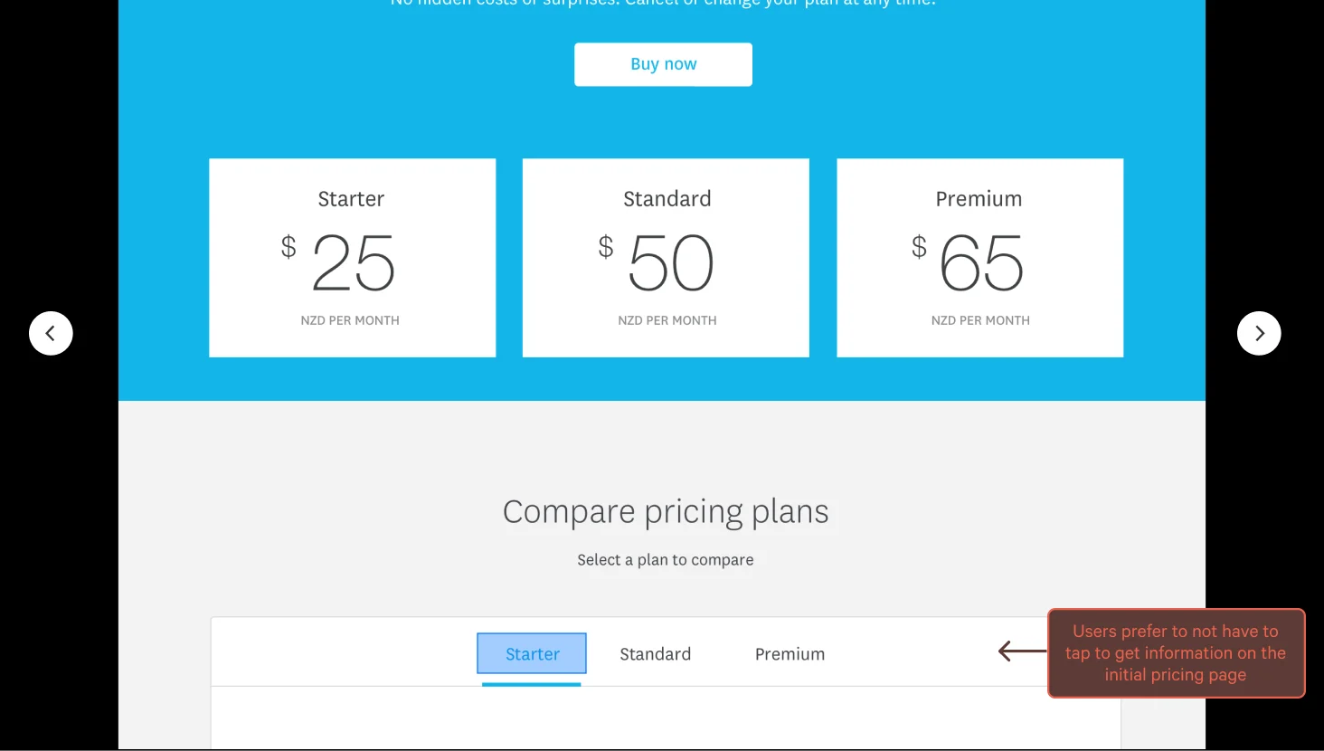
During testing, we observed that simpler solutions were most appreciated. Users preferred scanning content rather than excessive clicking.
We identified two preferred solutions and refined them further based on feedback.
Step 2
A/B testing plan
After I finished design, I made an overview of the testing plan so that collaborating with the tech lead and delivery completion could go smoothly.
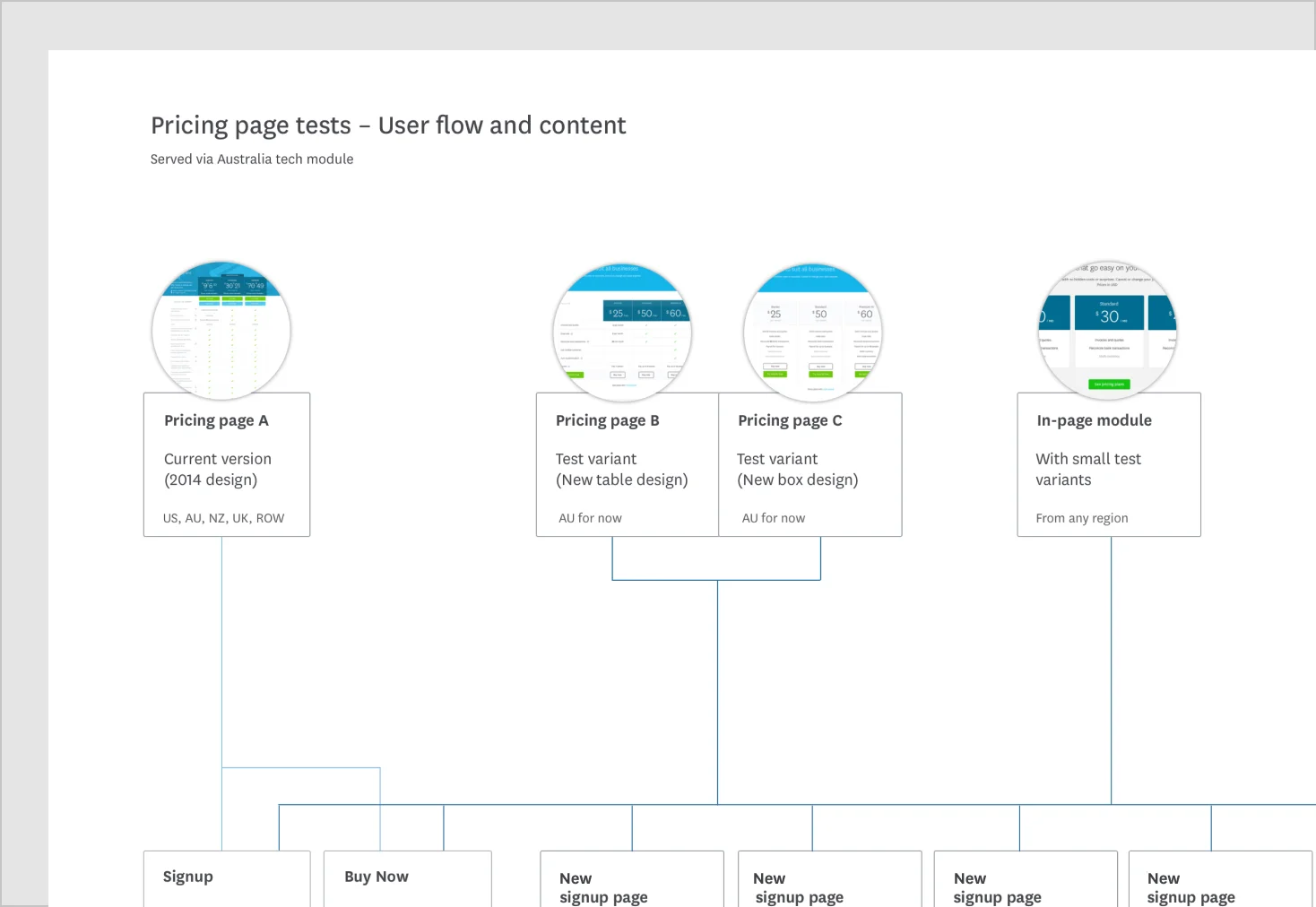
Split testing options
We would test 2 page designs against the original page. So it was an A B C test with 3 variants.
We also tested variations of micro-content inside a pricing widget that would be displayed on a number of marketing landing pages.
Final solutions
Take a look at the final design solutions I made that were published online and tested live in the market.

Two new variants in the wild
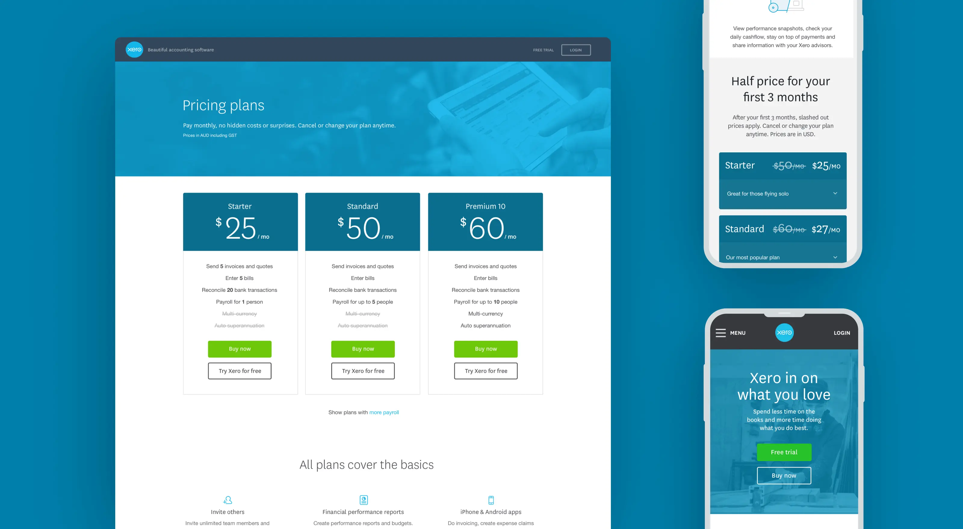
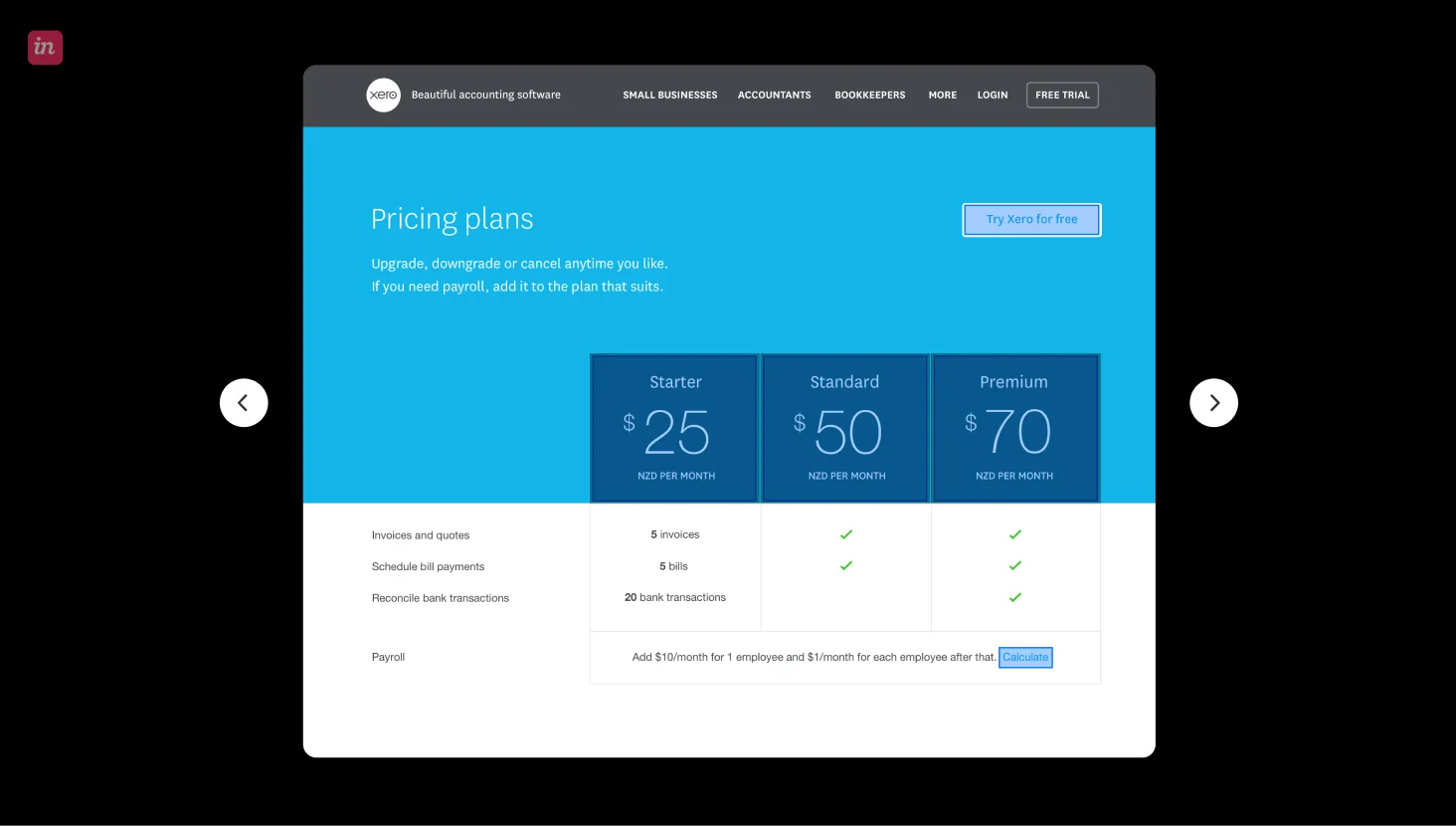
We tested my two new designs against the current version, a pricing page with cards and a more simplified table version. In both cases, I designed the pages to be clear and simple, with all information included.
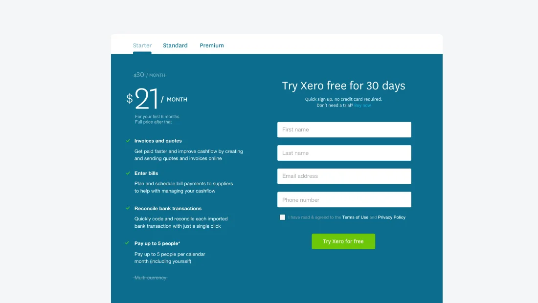
A new page to capture signups
In testing I noticed that users clicked the big price on the pricing page a lot. I suggested we created a signup from from that click, which also showed key relevant information for that pricing plan. This helped immensely for signups.

Designing for in-page micro content
I also designed final UI solutions for how pricing content should be displayed on other pages as opposed the main pricing page. I used accordions to hide and show information so the main content was scannable at a glance.
The impact
We got exceptional results.

26% increase in signups
Our winning pricing page increased signup conversion by 26%. This provided an outstanding financial benefit to Xero.

New pages that convert
I had also provided a new page based on testing insight that helped to move the needle considerably.

Better experience
The pricing page was much more pleasant for viewers to use. One small win for a busy small business owner!
More from Camille’s portfolio

Payroll for ANNA Money
PRODUCT DESIGN

Bookkeeping Score for ANNA Money
PRODUCT DESIGN

Invoicing for ANNA Money
PRODUCT DESIGN

Galderma SEO Microsite
UX DESIGN

Techspace
UX/UI DESIGN

Xero Pricing Plans
UX/UI DESIGN